Our Core Principles
In order to continue growing trusted networks across healthcare, we established core principles that both celebrate what has made us successful so far and give us the tools to prepare for what’s next. For us, this is our value set, consisting of six tenets that guide our internal and external interactions.
We act in service of our heroes: healthcare professionals. Their challenges, motivators, and perspective are at the forefront of every product decision, brand element, and company effort.
We value learning over all else. We aren’t afraid to experiment, change, or challenge the status quo.
We simplify where we can because healthcare is complicated enough.
We take accountability for our actions when things go to plan and especially when they don’t.
We advocate for a level playing field where everyone’s diverse experiences and skill sets are treated with equal value.
We believe good days and bad days are a fact of life but still look for opportunities to make each other’s and our users’ days a little bit brighter.
Our Brand Refresh
However, all of this is just words until they become actions. We’ve already begun taking steps to start holding ourselves accountable.
If you’ve recently updated your Siilo app to version 6.0, you may have noticed that things look a little different. We’ve refreshed our brand to better reflect who we are, what we value, and where we are going. Here are the design decisions behind some of the notable changes:
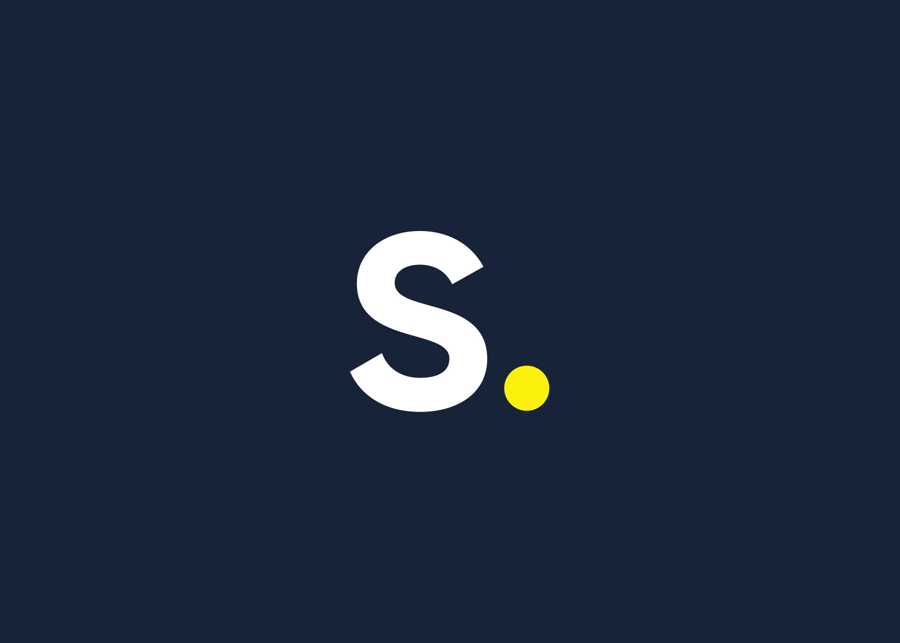
App Icon: The fresh yellow dot in our new app icon indicates where Siilo stops and healthcare collaboration begins. We’ve made it yellow to highlight what’s important, which is that Siilo is your starting point for a simple, secure, and collaborative way to practice medicine.
Logo: The adjusted spacing and size of our logo reflects the sense of consistency we want to bring to our brand. Consistency communicates trust, and trust is essential to building strong networks.
Font: We chose Siilo’s new font, TT Norms, for readability, ensuring that every message exchanged can reliably (and literally) be seen.
Colours: Upgrading our colour palette was as much an aesthetic choice as it is a strategic one. We’ve deepened the Night Shift colour to help it stand out against bright white screens, enriched the Highlighter Yellow to call attention to what matters, and added secondary colours to make our communications more compelling.
The brand refresh is just the beginning, we hope to continue with meaningful improvements to our website, our product, and our processes. Your continued support and enthusiasm for Siilo has allowed us to get where we are today, and we can’t grow into our vision without you. Thank you for trusting us to be your point of connection and collaboration. We ask that you please continue to share your suggestions and ideas with Team Siilo. Let’s practice medicine together!